When I arrive at David Pearson’s studio in the romantic sounding Back Hill in Clerkenwell, London, he’s busy in the ladies toilets, washing up plates from last night’s fish and chip supper. He’s immediately likeable; self-effacing, irreverent, energetic and funny. Best known for his book design work with Penguin Books, but with a portfolio that spans several other publishing houses and a glorious spew of awards and countless nominations, at the age of thirty two, Pearson is by far the youngest designer I’ve ever interviewed for a profile article.
Born in Cleethorpes and raised in Grimsby, the son of a shoe shop owner, his first run in with graphic design was a man who came to make a sign for his father’s shop. “He wore brogues and that fact impressed me” recalls Pearson. The brogue wearing sign maker turned out to be the local art and design foundation teacher, a man called Mike Wilks and Pearson found that his love of history and art could become a career if he directed his passion towards graphic design. Later on his tutors at St Martins, Phil Baines and Susan Dixon would lead to a further enlightenment and collaboration.
We start the interview by talking about Penguin Books, the publishing house that jettisoned Pearson into the design establishment. Pearson’s fascination with the history of the company started early in life as he reminisces “I remember my parents had a box set of Penguin books with multicoloured spines, I used them like toy building blocks, taking them out and rearranging them, at the age of 3 or 4, it all started then.” Later on the rich design history of Penguin provided Pearson with plenty of scope to research and arrive at his own conclusions about his own working practices. “I was drawn to the modernist element” explains Pearson, “the early 1960’s period of book design by people like Alan Fletcher and Derek Birdsall. There was an interest twist in the very abstracted, sometimes sinister, imagery that they used. I like the fact that at times you have to decode the image to understand the context and subject of the book.”
Pearson’s personal interest in the company was soon picked up by the in house team at Penguin who were only too happy to let him loose on some of the more onerous design tasks “I rebranded all their reference books” explains Pearson, “I was a junior designer and working on reference books were seen as a bit of a bum deal for most people, but I’ve got that kind of brain, I really wanted to do it, it fascinated me.”
Pearson was in the right place at the right time. The company was gearing up to it’s 70th anniversary and having a willing and able designer interested in the companies archives meant that that Penguin was able to get far more out of the arrangement than if they’d hired someone less passionate about the history of the place.
It would be an exaggeration to say that Pearson exposed the archives single handed but he has certainly been an excellent design ambassador, a key player in the re-awakening of the brand to a point where it’s now impossible at the moment to think about Penguin without its associated design history. We talk about the current trend by Penguin to commercially milk their design ancestry with everything from mugs to tea towels and deckchairs “they are flogging it to death” muses Pearson “its got a little bit hideous hasn’t it?”.
We then move on to talk about Pearson’s design work within the organisation. When I ask him whether working for Penguin was an easy ride he astutely points out “It was an experiment from their point of view. I had a free hand, it made me look like a better designer. I got given more responsibility and in turn more freedom. It was a joy to work with a team that allowed you to do, within reason, whatever you wanted to do.”
One example of this was a logo redesign. “Back in 2002 Pentagram were given the job of tweaking the iconic Penguin logo, someone new arrived at head office and they wanted to make a statement” explains Pearson. I decided to create my own logo as originally there were two logos for the company” Pearson was even allowed to use his ‘unofficial’ logo on the books he designed, which reveals not only the trust and faith Penguin must have had in their junior but also, perhaps, a glimmer of what made Penguin the iconic publishing house in the first place; giving the designer the freedom to explore and exploit the brand.
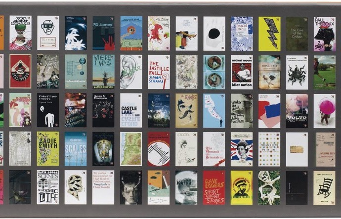
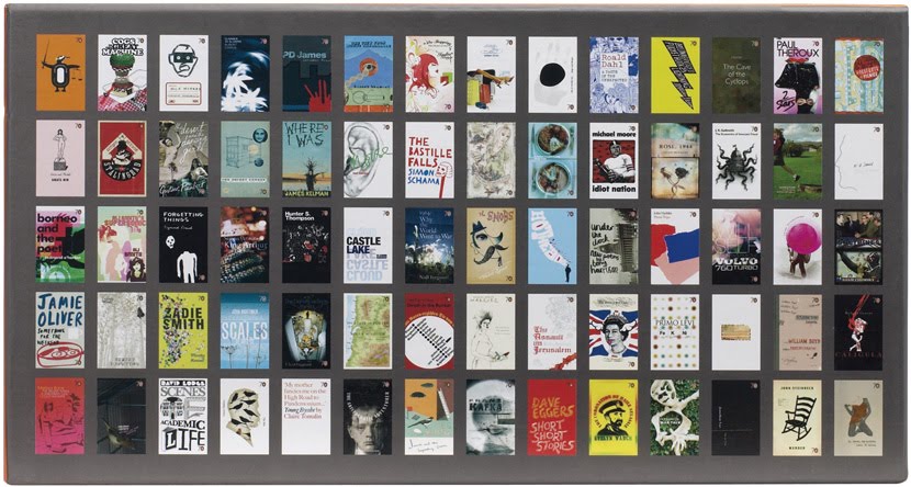
By 2004 Pearson had started work on, what would become the backbone of his book design portfolio, The Great Ideas Series.
Each volume contains twenty titles; each title is a classic philosophical work. Pearson was keen to collaborate on the task and invited Alistair Hall and his ex tutors Phil Baines and Susan Dixon to join him. “When David first mentioned the series it sounded exciting” explains Baines, “his first roughs, although slightly inaccurate historically, clearly showed what he wanted to do: balance historical sensitivity with the particular communicative requirements of book covers. He asked Catherine Dixon and I to give historical pointers and asked if we’d like to contribute designs as well. We ended up doing designs for books whose writing pre-dated print, at that point David felt that we would be more comfortable with that area than he.” The series was a success and Penguin commissioned four more, a commission that is still being worked on by the same team today.
Further collaboration with Phil Baines was possible in 2005 when Pearson initiated Penguin by Design, a book charting 70 years of paperback design. He asked Baines to write the book and although Baines admits he wasn’t sure he knew enough about the subject he said yes. “The design had already been suggested and we talked about how much text, and of what kind, and went from there” states Baines, I made a couple of visits to the archive, I fed him shopping lists, and he’d make a shortlist from which we edited back to make the book. There was a lot of irreverent email banter, quite a lot of beer, late nights, and pushing the deadline.”
Talking to Pearson about archive research it’s clear that it’s the lynch pin to his success as a designer. “As you can see I’ve got an ‘archive tan’” laughs Pearson “I spend a lot of time in doors, probably too much for my own good, conducing research. It makes me feel like I’ve made the right design decisions, that confidence in history is important to me”.
I ask him whether or not this leads to innovation or retrospection? “I look for the things that went wrong with the print process that don’t happen any more” states Pearson, “misregistering for instance or images cropped in an unusual, slightly scary way. I like the back story. I try to move modern print back to that point, giving the reader something that challenges the eye a bit. But it is contrived, I don’t know where my work is going to sit in a few years time, is it going to fail to keep its place?”
My question, although basic, touched a nerve. Later, via email Pearson responds “I feel slightly uncomfortable with the retro label as it feels a little too simplistic perhaps. In the briefing processes we were keen to avoid producing pure pastiche; rather we tried to provide the work a modern – or even post-modern – twist. This is perhaps most apparent with Great Ideas where quite often you are seeing two visual worlds collide.”
Pearson, Baines, Dixon and Hall have certainly managed to keep the pace and variation and Pearson is satisfied with the work. “Generally speaking, I have liked the covers more as we have progressed: partly because I tend to feel embarrassed about my older work and partly because I feel I have taken more risks as I’ve become more senior” muses Pearson. “That said, I will always look most fondly at certain covers in the first series which helped me to realise the potential of the project. In particular, Phil Baines’s cover for Meditations showed me that I could push things much further than I had originally imagined, since it broke so many established rules” explains Pearson.
At the time of my visit, Pearson was due to finish the fifth and final series of Great Ideas. I got the feeling that this may be a turning point in his career and asked him whether he felt that ‘the penguin had become the albatross around his neck’.
His mood turns sanguine and nostalgic as he ponders on the series and the possibility of the end of his working relationship with the brand that he has loved since childhood. “I have loved working on a project that seems to compliment my own skill base” recalls Pearson, “that said, 100 covers is a lot, some might say too many, so it feels right to bring things to a close. I also worry about becoming typecast.”
A book designer worrying about being typecast, there is a joke in there somewhere. We move on to talk about the wider role of the book designer, is it, for instance the job of a designer to sell the book? Does the designer have a responsibility to the author? And what is it like to work for a contemporary author rather than one, like all bar one of the Great Ideas series, authors that died hundreds of years ago?
“Let’s face it,” explains Pearson “had many of the authors that I’ve worked on been around today they wouldn’t of liked what I’d done, they would of thought my designs as wholly inappropriate” Providing us with an example Pearson states “with Chinua Achebe, the only living author in the Great Ideas series, I had to get an approval and he rejected it straight off. The design was meant to be kitsch, tongue in cheek and he thought that people wouldn’t get that quick enough. I’m thinking ‘can we push it further – how cheeky can I be? I want to make it B movie. The book is based on An Image of Africa by Joseph Conrad, it has a safari lounge ascetic, it’s an interesting situation, maybe I should of spoken to Achebe before I started work on it”
Putting Penguin to one side we then look at the work that Pearson has created for Éditions Zulma, a French publishing house that he’s been working with since 2006. Clearly more relaxed and an ease with the workflow Pearson explains the process, “it’s more of a meditative process for these. The covers are a result of me experimenting with form, without the weight of the text on my shoulders, as I can’t read French, so it’s probably more closely aligned with knitting as a pastime.”
Apart from ‘knitting’ Pearson has been busy setting up his own publishing house called White’s Books with Jon Jackson, who is the ‘brains behind it’ according to Pearson.
Using classic literature which is copyright free they’ve been able to repackage the great works under the art direction of Pearson who has commissioned illustrators to produce cover designs. “These are illustrators that I greatly admire and for selfish reasons, have always wanted to work with,” explains Pearson. “It genuinely feels like we offer an attractive brief, under the auspice of a non-repeating, ‘narrative’ pattern” Pearson is keen to point out that he likes to work with illustrators who produce ‘things’ be it lino cut or rubber stamps. The project is an excellent vehicle for his interest in collaboration and book design and so far he’s worked with a wide group of illustrators including Petra Börner and Stanley Donwood. Aside from the design Pearson has been learning about the book business as a whole, “I want to get experience in the industry, I want to learn about books are made and sold” reveals Pearson, “it’s a murky business dealing with Amazon but I’ve got to learn”.
I ask what will fill the void left by Penguin and Pearson says that he’s going to paint some shelves and watch the World Cup. He shows me his guilty pleasure, some 1970’s Corgi books front covers with scantily clad ladies draped over the titles and we talk about our future and the future of publishing.
Pearson is arming himself, like many of our generation, with tools beyond his profession in order to survive. The irreverent humour and the self effacing nature are not superficial tactics, they are as necessary to him as his research, or as Pearson puts it…“I really don’t know where my future lies. This industry changes so quickly. I just hope I’m fleet footed enough to go with it. If not, I am quite a handy window cleaner.”
http://www.davidpearsondesign.comTweet